PHOTOGRAPHY DRAWING (PhtD™) – MY BLACK AND WHITE (en)VISIONING AND PROCESSING METHOD
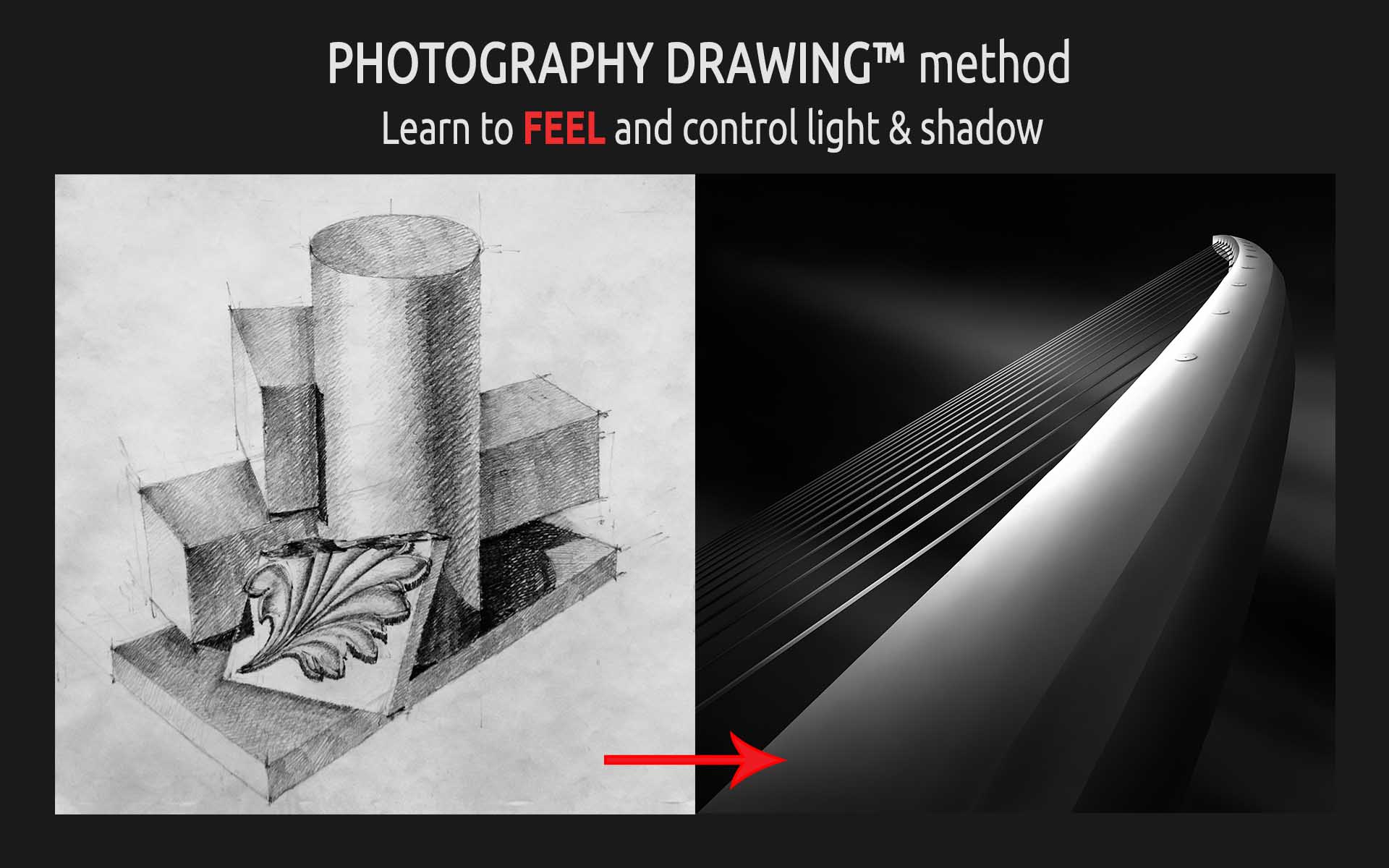
What is Photography Drawing (PhtD)™?
Photography Drawing (PhtD) is my original advanced black and white processing method, based on the principles of how light interacts with shapes and volumes, that are the fundamentals of drawing, of painting, of art in general.
In Photography Drawing I adapt the rules and principles of drawing to black and white photography, so I can have the same perfect control over light and shadow you have when drawing in black pencil.
NOTE: This article was first published in February 2014.
INTRODUCTION
I was asked many times which is the secret of my images. What I do to make them look “alive”. And my answer always was that in essence “I draw my photographs”. I have mentioned this method many times before but I have never till now made a serious and structured study about what it means. This is the first time I’m explaining what my black and white (en)Visioning and processing method consist of and where its bases are. This is a concept and method that have never been presented before, not by me nor by anyone else. What you will read here is something very logical that my background in architecture, drawing and art, in general, helped me discover and then apply these principles in photography too. In two words my method is about how to use the techniques I use in black and white drawing to process my black and white photographs.
This discovery was a revelation that shaped my work ever since and it is tightly related to the way I see photography as (en)Visionography™ (more about this at www.envisionography.com). It is a collection of simple tools that will show you how to use
light and shadow, how to control them in order for your images to look surreal but realistic at the same time. Have you seen any painting by Salvador Dali or by René Magritte? They knew this secret too, like many other artists whose work you admire. Their paintings may look like out of this world but the use of light and shadow is perfect.
This is what The Method of Photography Drawing will teach you. How to create even the most unexpected images and make them look real, have presence and keep the viewer interested for a long time. You need to make the viewers wonder what is this world they step in when they look at your work, you have to make the viewer want to wander inside the image so you can charm him and show him your world. This is how you can do it.
I elaborated this study initially to be published in the book I’m working on “From Basics to Fine Art – Black and White Photography – Architecture and Beyond”, book that will be published in a matter of weeks, but I wanted to share a part of this study with everyone too, as a free offer and a sneak peek inside my mind. This is a fragment from the book (a big one but still a fragment, as the study is too long for just a blog post) but you will find the whole study in the book, including all the Processing Steps in Photography Drawing not included here, along with many other topics (fine art, architecture, composition, vision, black and white processing etc.) that sustain each other and that lie at the base of our way of creation, of our “secret”. You will know exactly what the authors do to create the work they create. But before even getting the book, here is another article I posted and that will be helpful.
– The Guide to Vision™ by Julia Anna Gospodarou
UPDATE
I am periodically reviewing this article and adding new material, so it would be a good idea for you to subscribe to my website and come back check it from time to time.
The book has now been published and has received hundreds of excellent reviews, becoming, soon after its publication, a best seller and one of the most important books on Fine Art photography you can find and “the best book on B&W photography written in the past 40 years” as highly rated professional critics as George DeWolfe say. We can only be happy about it and hope the information in this book can help other artists discover what we discovered too: that Vision is what it is all about and this is what pushes you to learn all the other things too so you can express it in images. You can find the book in our webstore at this link.
FROM BASICS TO FINE ART – BLACK AND WHITE PHOTOGRAPHY
An addition to the material in the book is the extensive study of vision, (en)Visionography and fine art photography, with hands-on advice on long exposure and architecture photography and accompanied by an eBook on black and white processing with my processing method Photography Drawing, you can find in my recently released video tutorial below.
LONG EXPOSURE, ARCHITECTURE, FINE ART PHOTOGRAPHY – CREATING (en)VISIONOGRAPHY
Speaking of long exposure, since this is one of the techniques I use extensively in my photography, if you want to learn it you can read my Long Exposure Photography Extensive Tutorial that is a complete guide to this fascinating technique, and you can also purchase my video tutorial I am mentioning above.
MASTERING BLACK AND WHITE PHOTOGRAPHY PROCESSING – FROM VISION TO FINAL IMAGE
If you want to study Photography Drawing more in depth this course is for you. In this course and eBook, you will learn the secrets of this original method that transforms a two-dimensional image taken by the camera into a three-dimensional photograph, where volumes come to life and light shapes the forms. You will learn how to create the three-dimensional shapes you see in Julia’s work so you can make your images come to life too.
BLACK AND WHITE (EN) VISIONING AND PROCESSING WITH THE METHOD OF PHOTOGRAPHY DRAWING
VISUAL THINKING AND PHOTOGRAPHY DRAWING
The method of Photography Drawing is based on visual thinking and on how we interpret the signals the images send to our brain in order to make us understand what we see. Visual thinking is a non-verbal way of thinking and means thinking in images, opposed to thinking in words. It uses the right side of the brain, the side that is responsible for emotional and creative thinking, the one that is related to intuition and makes possible the existence of photographic memory.
Thinking in images is an essential tool for the architectural photographer, just like for the architect and generally for all visual artists, because it helps them feel the space and understand its rules. Visual thinking helps us recognize volumes and the relations they have with each other, it helps us understand the relationship between positive and negative architectural space, it helps us understand how light affects volumes and how it renders spaces.
Understanding these aspects is the first step in learning how to use the information our brain receives from visually interpreting the world in creating good black and white architectural photography, because we will know how the visual information is transmitted and what impresses the eye. And by knowing how this process works we can use it in our images so we can make them more expressive and help them reach the viewer more easily.
WHAT IS A PHOTOGRAPH?
The first question one should ask in order to understand what the method of photography drawing is, is:
What is a photograph?
The answer to this question comes easily:
First and foremost, a photograph is a study of light.
Whether we refer to the light we capture or to the light we shape and enhance through developing or processing, the result is light combined with shadow, in different amounts and intensities, that is imprinted on the base where the image is created: the capturing surface first, the developing surface afterwards and the printing surface as the end result.
In the analog era, the capturing surface was the film, while now, in the digital era, the capturing surface became the camera sensor. As for the developing surface, in the analog era, this role was played by both the film and the printing paper, as a two-step developing process. Printing a photograph from film implies two phases of developing the image: the first phase is developing the film and the second is enlarging the image and transferring it from film to paper, transforming it from a negative image on the film into a positive image on paper and also enhancing the result by dodging, burning or other developing techniques.
In the digital era the phases of developing the film and then of transferring the image from film to paper were replaced by the phase of processing the image by using a computer and editing software; therefore, the editing monitor is now the new developing surface for an image. Printing in the case of digital photography is only the last step of the process when everything that has been done so far is transferred from the editing monitor to the paper, while being adapted to it through calibration and other specific digital printing operations.
Digital printing is an important step in creating the final image, but it is not as complex as it was in film photography, as it does not imply processing the image. All the processing has been done on the monitor, or in other words on the “digital developing surface”. This is why in digital photography the monitor where the photograph is processed, together with the editing software that enables processing, have become the most important elements of the darkroom and the phase of processing is the one that will determine how the final image will look like.
In digital fine art photography, even more than in all the other types of photography, the processing we do to an image is what will influence the final result the most, even more than the capturing surface does and the way the light leaves its imprint on it.
This is why the method of Photography Drawing focuses on the phase of processing, because this is, in essence, the moment when we create the photograph: the moment we take the light we captured and transform it into the light we envisioned, transform it into art. How we will do this? I will explain everything in the next parts of this chapter.

LIGHT BEHAVIOR IN BLACK AND WHITE PHOTOGRAPHY AND CLASSICAL DRAWING
The first thing we determined in our analysis was that a photograph is a study of light. Now going further, let us say that in the case of a black and white photograph, the light in the photograph is seen by the viewer in the form of shades of gray, as different combinations of black with white, resulting in a multitude of tones of black, white and grays which are able to recreate the image and impress the eye.
The above can be stated in a very similar way and holds true also in the case of drawing.
Especially in the case of classical drawing in black pencil, the result as a final image can be very similar visually to a black and white photograph. This happens because, in both cases, we deal with light when presenting the world rather than with color, so what defines both a black and white drawing and a black and white photograph is how light behaves when it comes in contact with shapes and volumes.
DRAWING PHOTOGRAPHS AND PHOTOGRAPHY DRAWING
You will read in the next chapter of this book the rules of good black and white photography which will explain how to treat a black and white image to embody your vision in the most faithful way. But before that, I will present you a set of rules that I apply in conceiving and processing my black and white images to obtain the results I envision and the surreal-realistic look that can be seen in my work.
These are the Rules of Photography Drawing and they are the base on which my envisioning-processing method and the core of my black and white workflow are built. I am calling the method using these principles and rules the Method of Photography Drawing and the process through which I go when creating my black and white images drawing photographs.
Photography Drawing is a personal creative method that allows me to express my vision in the most creative, correct and impressive way. The innovation of this method and what it brings new is that I am incorporating in the processing workflow the basic rules and principles used in the case of classical drawing in black pencil, principles that can stand also for other kinds of drawing and even for other visual arts and that I adapted here to photography, especially to black and white architectural photography.
The method of Photography Drawing is related to how to shape the volumes by using light as a tool and the concept I developed is about how to process and render an image the same way you would draw it, using the same principles of shaping the light as in classical drawing, only this time putting them in practice by using different tools than in drawing: processing software instead of paper and black pencil.
The software I use most of all in processing my black and white images through the method of Photography Drawing are Photoshop, Lightroom, Topaz Labs, and the DxO software including the NIK Collection. this is, however, not an exhaustive list, if you respect the principles you can find other ways, tools, and means to do it that can work just as well. I will show you how you can use these principles in your own work: what you will do is that you will use the techniques you would use in drawing but this time you will use them to envision and process a photograph.
In addition to the direct use of this method in your work, it will also give you an insight into how you can combine different kinds of art to create something new. As I am saying in the Guide to Vision™ previously in this book, one of the things you have to do in order to find your vision and create a personal style is to try to find inspiration for your work also in other types of art, not necessarily by practicing other genres, but by adapting to photography different techniques, approaches or principles that are characteristic to another genre.
The results can be outstanding and you may find a new way of expression through this. Why not trying, for instance, to work on your images the way you would play the piano if you were a pianist, or the way you would act if you were an actor?
Why not “sculpt” your images, not only “draw” them?
The first step towards discovering and creating something new is to think out of the box, to start from scratch and find new solutions even for things that have been solved before by others.
The method of Photography Drawing is not only a practical guide on how I create my images but also the theoretical base for why I do the things the way I do them. Because whatever we do in photography, in fine art photography especially and in art ultimately, has no sense and value if we do not know WHY we do it. The “why?” is much more important than the “how?” and even more important than the end result, the image, which would be like a hollow case without content if we did what we do “just because” (just because it is trendy, just because it looks good, just because others do it etc.) and not because we have a theoretic reason for doing it and an intention.
The moment I discovered this parallelism between classical drawing and black and white photography and how to use it in envisioning and processing my images was like an epiphany for me and it shaped my fine art work ever since. It was a crucial moment in my artistic evolution and also the moment I finally understood how I can use editing software to create and not only to edit. I understood then that I do not need to follow the known path just because I know it, but I can build on it and adapt everything to who I am an artist, thus finding the best way of expressing my own art. The baggage of knowledge I had from the time I was drawing in black and white (especially buildings and still-life) was instrumental in helping me make the connection between drawing and photography and then in knowing how to apply the principles of classical drawing in editing a black and white image. This is why I want to share this knowledge now, because it is an outstanding tool for understanding light, how it affects volumes and how we can use it in processing in order to transpose our ideas in the image in a believable way, even when we will change reality completely to suit our vision.
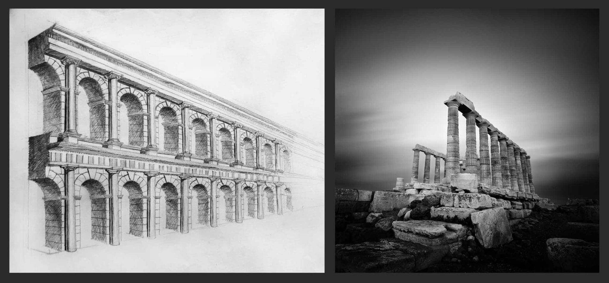
I will enumerate some of the principles and rules that lie at the base of this concept in the following pages, and I will present the steps you have to go through when “drawing your photographs” by giving a few examples comprising some of my black and white drawings and how they relate and mirror into my way of processing.

– Above: The Method of Photography Drawing – Examples on a drawing and a photograph –
WHAT DOES “VALUE” MEAN IN BLACK AND WHITE DRAWING?
First let me explain a term that I will use when talking about these rules and principles, a term that has to do with shaping the light and with rendering the volumes when drawing so as to create the illusion of a three-dimensional image. The term I am referring to is VALUE which in a way is the equivalent of TONE in black and white photography.
What is “value”? In black and white drawing value is the relative lightness or darkness of a color or of a shade of gray.
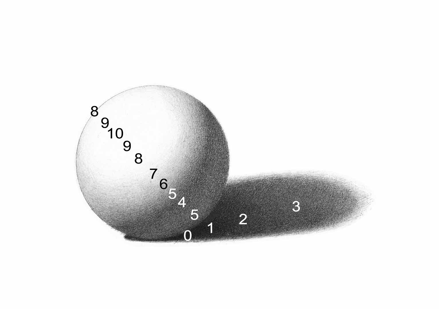
In simpler words and applied to black and white photography, which is what we are studying in this book, value means how bright or how dark a certain tone is. In the case of drawing the values start from 1, which is the brightest area of the subject/drawing and is considered to be the white of the paper and they go up to 9 which is used for the darkest cast shadow.
The numbers used to name the values in drawing (1 to 9) are opposed to the ones used to name the brightness/darkness of the tones in photography (Zones 10 to 0) according to Ansel Adams’ Zone System. The tones in a photograph have been described, categorized and named by Ansel Adams in the “Zone System”, a system which is in essence a chart that maps the tones in a photograph, from the brightest, which is considered pure white and is symbolized by the number 10 (Zone 10) till the darkest, which is considered pure black and is symbolized by number 0 (Zone 0).
We will study this system in detail in the next chapter of the book “How to See in Black and White”, therefore I will not elaborate on it for now. For now, you only need to keep in mind that the numbers symbolizing the values in drawing are opposite to those symbolizing the tones in photography. In order to keep everything simple and to apply the principles of drawing to black and white photography without needing to make the conversion from one system to the other, the examples I will present to you will use values showing the tones in the Zone system (which are the reverse of the values as naming) instead. You will know from now on that in our examples Zone 0 means pure black and Zone 10 means pure white and the rest of the zones are the different values/tones of gray in-between.
VOLUME RENDERING IN CLASSICAL DRAWING – APPLIED TO PHOTOGRAPHY DRAWING
The rules of rendering volumes in classical black and white drawing are meant to give the artist a tool that will be used to create on paper an image of a volume which has the most resemblance with a real volume. This is accomplished by creating light and shadow areas rendered on the drawing surface with a black graphite pencil, charcoal etc.
Light and shadow define volumes from a visual point of view and rendering volumes with light and shadow creates presence. Creating presence is the goal of both classical drawing and black and white photography and this can be achieved in both cases in a similar way. But before learning how to use light and shadow in practice we need to train our eye to see them around us. We need to start seeing like an artist.
HOW TO SEE LIGHT AND SHADOW LIKE AN ARTIST IN 8 STEPS?
The first 2 things we will have to identify or to decide where to place when drawing or rendering volumes in a photograph are:
1/ Where is the light source situated?
2/ What is the direction of light?
Right after answering these questions we need to answer a few more questions:
3/ Where is the light situated on the volume?
4/ Which is the brightest area in the image?
5/ Where are the shadows?
6/ Where is the darkest area in the image?
7/ Where are the cast shadows?
8/ Which is the subject of the image and the most important point, the one you want the viewer to see first?
These 8 steps will give us the frame on which we will build our image, be it a drawing or a photograph. We have to understand from where the light comes, or from where we want it to come and how the light and shadows are laid out so we can keep them consistent while drawing on paper or “drawing a photograph”. Also, we need to know which is our subject and where we want the eye of the viewer to go first.
A good way to verify where your lights and shadows are situated is to squint your eyes and watch the scene in front of you as a general mass of light and dark areas. This will help to identify more easily the placement of the different light intensities on the volumes you see.
Another use of squinting to look at your scene is that this way you will more easily see it in black and white even if you are looking at a color scene, as everything around us is. Likewise, this practice can help in a real way when processing a photograph to check the tones and contrast level you have achieved and see where you need to intervene to enhance the image.
The light hitting a volume will always follow the laws of physics as for its intensity and distribution and is directly related to the source emitting it as for its power, shape, position, direction, hue and distance from the subject.
Depending on all these parameters, the effect created on the volumes can be harsher or softer, more intense or more diffuse, it can come from one direction or another. These characteristics will be visible on the volumes receiving the light in the form of bright or dark areas and will facilitate the perception of the world by the viewer as a three-dimensional space. Transferring the image of these real volumes on paper by drawing them is done by applying a few principles of rendering light and shadow, that we will see now.
PRINCIPLES OF RENDERING LIGHT AND SHADOW ON A VOLUME IN CLASSICAL DRAWING
The values or tones used to render a volume in classical drawing are grouped in categories relatively to whether they are “lights” or “shadows”. Obviously, the bright values are the lights and the dark ones are the shadows.
Each category can be divided into sub-categories, depending on where it is situated relative to the source of light. Let us see which are these categories, so we can understand better how light behaves when it comes in contact with a shape or volume and use this information in light shaping volumes in photography too. They are marked in the next image and I will also mention them.
LIGHT AREAS
Highlight – the brightest part of the subject (image), the area that faces the light – the white of the paper in drawing or pure white in photography (corresponding to Zone 10 in the Zone System).
Light – the generally bright areas of the image, without reaching the brightest values in terms of intensity but without touching the shadow either (corresponding to Zones 9 to 8 in the Zone System).
Halftone – the areas where the shadow begins. This is the mid-gray tones area (corresponding to Zones 7 to 6 in the Zone System).
SHADOW AREAS
Form Shadow – the main shadow on the volume, the place which is situated opposite from the light source and that will receive the least amount of light. This is the darkest area of an object and it is very important for defining the shape of the object. Light creates accents, but shadow creates form (corresponding to Zones 5 to 4 in the Zone System).
Reflected Light – shadow area where the intensity of the shadow is lower due to light being reflected on the volume from the luminosity of ground and the surrounding surfaces (approximately corresponding to Zones 5 in the Zone System).
Cast Shadow – the shadow the volume leaves on the surface behind it relative to the source of light. It is darker in the proximity of the volume and it becomes lighter the farther away it is from the volume. The farthest shadowed area from the volume, just outside the cast shadow’s outline is called penumbra (corresponding to Zones 3 to 1 in the Zone System).
Occlusion Shadow – the darkest area of the shadows and it appears at the contact of the volume with the surface on which it is placed, being essentially the shadow under the volume (corresponding to Zone 0 in the Zone System).

If we look at the examples of the basic geometrical forms provided below we will see the same disposition of lights and shadows applied in all cases, on each type of volume. The principles are the same, what changes is the shell of the volume. We can see that in all cases the area covered by Zones 8 and 9 are fairly equal, then the light decreases very rapidly from Zone 7 to Zone 4.
The disposition of the light zones on any volume, simple or complex follows the same rules and this stands also in the case of the volumes of the buildings.
Consequently, understanding how light functions and how it affects a volume is an essential tool in knowing how to envision and process black and white architectural photographs, not only drawings on paper.
Now let’s see concretely how to render volumes using the principles of classical drawing. We will study these principles while considering the most common lighting situation of volumes lit by natural light coming from above at an angle (above left in the case of the examples used), which is what we will mostly find when shooting architectural objects outdoors. We will use to study these rules four basic geometric forms: the cylinder, sphere, cone and parallelepiped forms, which, when combined, can create almost every volume possible.

What we can see on the volumes I used as examples is the way the light renders them and the way this translates to shades of gray. Alternatively, we can name these shades of gray values or tones. Starting with the brightest tone of the Zone System which belongs to zone 10 and is equivalent to the white of the paper in drawing and to the pure white when processing a black and white image and ending with the darkest tone of the Zone System belonging to Zone 0 and being represented by the darkest shadow in drawing or pure black in photography, both drawing and photograph will cover all the tones in between, tones that will become darker as the surface is situated farther and farther away from the source of light and of course lighter as we approach light (be it light coming from an artificial source or natural light coming from a direction).
THE RULES OF PHOTOGRAPHY DRAWING™
The Rules of Photography Drawing are based on the rules and principles of classical drawing as they can be applied to black and white photography and they elaborate on the subject of using light shaping in order to create a correct and realistic volume rendering from the physics point of view. In addition to the principles of rendering volumes that we enumerated above, let us see some general rules that have their base in drawing but that can be adapted and used in both drawing as well as photography.
– 1st RULE
Show space and volume, not only shape.
The three-dimensional space and the volumes are the basis of architecture and architectural design. Architecture has almost no interest in two-dimensional shapes, but only in volumes and space. Therefore in drawing, while rendering an architectural object, this is the main goal we need to keep in mind: to show space and volumes, to not limit ourselves to two-dimensional shapes. This principle translates easily to architectural photography and has to do with enhancing the image so it shows more faithfully the space and the volumes existing in it.

– Above: Drawing of line compared with rendered drawing –
– 2nd RULE
Use the full tonal scale and the right rendering value/tone in the right place on an object. Create gradations of value or shading In order to create the illusion of volume.
A drawing, just like a photograph, is a two-dimensional representation of a three-dimensional world. To present this three-dimensional world on a two-dimensional medium as paper is, the drawing needs to recreate something that cannot be seen normally – it needs to recreate a volume (or the illusion of a volume) on a flat surface – and achieves this by using line, light and shadow.
Essentially, what we do when drawing is to add depth to a plane by making the eye believe that it sees a volume while it only sees its projection on paper. The drawing shows the representation of the volume through the use of light and dark tones. In order to achieve this three-dimensional effect, we use different intensities of rendition with the black pencil, different values, applied in specific places on the volumes.
These values need to cover the full tonal range between black and white in order to create a believable result and where exactly we will apply the light/dark values has to do with how light falls on the volume as we have already explained in the principles of rendering volumes. This is the basic rule in rendering volumes and it is just as true in drawing as it is in black and white photography.
& A time to Look Back- Photograph by Julia Anna Gospodarou
– Above: 2nd Rule: Light shaping with the method of Photography Drawing™ in drawing and photography – Use the full value/tonal range to render the volumes in a photograph, the same as you would so if drawing them –
– 3rd RULE
Know that in most cases you can control the outdoor light just like you would control an indoor artificial source. How? By processing the image according to your vision and not to the given conditions of your shot.
This is a rule many will not agree with. They are free to not agree. Everything is possible in art and this gives them the right to not agree just as it gives the right to those wanting to follow it to do so. “Manipulating” an image lies at the base of fine art photography, that means doing whatever it takes to bring the image you create as close as you can to your vision and to yourself as an artist. No tools or means are forbidden or excluded, as long as what you create is art and not a cacophony.
Art means breaking the rules, but you have to break them by keeping the result as a possible reality even if an otherworldly reality like a Chagall-like reality or like a Dali-like one. Both Chagall and Dali have “manipulated” reality but have a look at their paintings and you will see that the basic rules that the eye is used to have been respected, one of them being the correct rendering of volumes and respecting the light they work with regardless if they change everything else.
Therefore you are free to disregard the existing light and create your own, but be careful to first learn how light behaves and the rules of correct rendering. If you look at my work you will see that even when I change everything else I never touch the basic rules of how light works on volumes.

– Above: 3rd Rule: Changing the light balance from the RAW image to the final image according to our vision and not depending on the existing light conditions –
– 4th RULE
Apply the light/shadows on a volume according to the direction of the light falling on the volume.
The place where the lights and shadows will be visible on a volume depends on the direction of light falling on it, the areas closer to the light will be brighter and the ones farther away from the light will be darker. We have to keep in mind that the direction of light has to be the same for all the volumes in the scene, unless we have multiple sources of light and then the light/shadow chart of the image will be more complex. A rule that stands for all kinds of visual representation and that some tend to forget since it is not obvious when we watch volumes in real life.
– 5th RULE
Know that light disposition is influencing your composition.
How light is laid out in the frame has to do not only with correctly rendering volumes but it also affects the composition. Keep in mind that different textures and materials behave differently as for how they show light. Some absorb light, others reflect it, some create lower contrasts, others higher contrasts when they are lit. Consider their behavior both when composing the image you capture and when you process it, so as to be able to emphasize the areas you need to emphasize and subdue the rest.
In principle, you do not want to have in the foreground an object that absorbs the light and have lower contrast surrounded by objects that reflect the light and have stronger contrast. The object in the front will seem deprived of life surrounded by the other contrasty objects. If you need to have such an object in the foreground you will need to find a way to emphasize it consciously and keep the rest of the objects at a lower contrast so they do not compete with it. You may want to change your composition or point of view to improve the light balance in the image.

– Above: 5th Rule: Light influences composition – Different textures and materials render differently –
– 6th RULE
Squint (half-close) your eyes to identify light and shadow.
A good way of identifying the light and dark area in a scene is to squint your eyes when looking at the scene so you can only see the general values of light and not the details. This tool is used in the case of drawing or painting from nature and is a very efficient way or “reading” the light.
Make a habit from squinting also when looking at the scene you want to photograph, just as when you are processing an image. Besides helping you to identify the light and dark areas, this method helps you also to see a scene in black and white and to more easily understand where you have to place your values/tones in the image and how to achieve a balance and emphasize the important areas

– 7th RULE
Use visual tools to create the illusion of space.
The science of imaging together with the laws of physics have determined a set of universally valid tools that can be used to show space and depth in a visual representation like drawing, painting etc. The tools that can be used for creating the illusion of space in classical drawing are: linear perspective, atmospheric perspective, decrease in size for the objects placed further from the viewer (caused by linear perspective), decrease in rendering intensity and contrast for the objects in the background, in order to create depth (caused by atmospheric/aerial perspective), volume placement related to the viewer and volume overlapping.
These tools may be used separately or together, most of the times we will use them together to make a drawing look realistic or to recreate a scene we envisioned. We can use the same tools to process a black and white photograph, respecting the laws of perspective and of how light behaves in space.
– 8th RULE
Use the contrast of value/tone to separate the objects in space.
The juxtaposition of dark values (the corresponding of dark tones in drawing) with light values (the corresponding of light tones in drawing) creates contrast. Contrast helps to separate adjacent objects that are rendered with opposite values on their contact line. This is another important rule of classical drawing that can be applied very successfully in processing black and white photographs.
– 9th RULE
Use gradients to render volumes.
Light does not fall evenly on the surface of a volume due to the distance of each area of the surface from the source of light and this is happening even with an immense light source such as the sun. In addition to this, the light or shadow we see on a surface is made of both direct and reflected light or both shadow and reflected light.
This is why it is generally advisable to use light or shadow falling in gradient in order to render a surface. Meaning that the shadows will start darker on an edge and decrease in intensity towards the opposite edge, the same thing happening with the light. Used as rendering technique in drawing this principle can be applied to photography and will add depth to the image and make it look more three-dimensional.

– 10th RULE
Use areas of light and dark value/tone instead of lines to create the illusion of edges in volumes.
Even if drawing is considered by most as being mainly created by making use of lines, the reality is that we do not need lines to create a drawing, we only need them to sketch the objects on paper so we know where to apply rendering.
A drawing can be a drawing of lines, but not necessarily. The style of drawing I am referring to in the method of Photography Drawing is the drawing where we create the object by mainly rendering areas of value on each of its defined surfaces separately, these areas all having different intensities. We will create the illusion of edge in the volumes by alternating areas of dark value with areas of light value, the edges being the line created as a result of 2 areas of opposite brightness coming in contact – dark values/tones coming in contact with light values/tones.
The difference between successive sides of the same volume do not need to be big but we do need a difference in tone between 2 adjacent areas in order to create a line between them. The same effect can be created in photography when working on a base that is the captured image and not enhancing the edges of the volumes but working inside the surfaces which the edges delineate.

PHOTOGRAPHY DRAWING – PROCESSING STEPS
Processing a photograph by using the rules and principles of classical drawing follows a reverse direction than in the case of drawing an image while using the same principles.
In the case of drawing you start by adding volumes to one another to create a meaningful whole, while in the case of photography you already have the whole and, when using the method of Photography Drawing, you will need to subtract partial volumes from the whole, in order to process them separately, to render them one by one and then to add them back to the whole but after reshaping the light that falls on them, transforming it to suit your Intention, your Vision. The end result might be the same in principle, or as far as physics and the light study are concerned, but the initial process is the opposite.
The steps I make when following the method of Photography Drawing are most of the times the same. Some are conscious steps, some other have become a habit I do not think about but just do what I do as an automated process. The steps I tend to make automatically are the ones that have to do with “seeing in space”, with analyzing volumes and considering the options I have to use volumes to create something meaningful but that will not necessarily be faithful to reality, to what I have captured with my camera, but it will have to be faithful to my own representation of reality, to my vision. What I do as a first stage is to compare my vision with the reality and evaluate how much they have in common and how much I need to change in order to make the journey from reality to the final image.
(NB. The entire Photography Drawing chapter can be read in the book “From Basics to Fine Art” by Julia Anna Gospodarou & Joel Tjintjelaar)
FINAL WORD
I am presenting all the Processing Steps in Photography Drawing in the book “From Basics to Fine Art” where you can find everything about Photography Drawing and where I explain each step and what it consists of and how to practically go through the process. As I mentioned in the beginning, this is the first time I’m talking about this method extensively (February 2014), even though I have mentioned it many times before.
UPDATE
The book From Basics to Fine Art – Black and White Photography was published in May 2014 and you can order it on our webstore. The book is already a best-seller, and it is considered by critics and readers to be one of the most important books about black and white photography of the last decades.
FURTHER STUDY RESOURCES
FINE ART BLACK AND WHITE PHOTOGRAPHY, ARCHITECTURAL PHOTOGRAPHY, LONG EXPOSURE PHOTOGRAPHY
Find more resources about fine art black and white photography, (en)Visionography, long exposure photography and architecture photography in Julia Anna Gospodarou’s extensive collection of photography tutorials. To receive free future tutorials, you can subscribe here.
Learn more about how to create fine art photography, architectural photography, long exposure, etc. from conception to advanced processing in Julia’s video courses Understanding Fine Art Architectural Photography – The Complete Course, From Vision to Final Image – Mastering Black and White Photography Processing, in the video tutorial Long Exposure, Architecture, Fine Art Photography – Creating (en)Visionography, and the book From Basics to Fine Art – Black and White Photography, or by attending one of her highly appreciated workshops.
Find Julia’s recommendation for the best software and gear to create fine art photography and curated deals and discounts for these tools.
To study with Julia Anna Gospodarou personally, find out about our
Support our mission for high quality photography education. Donate now!
We believe in knowledge, education, and the freedom of spirit that creates great art. We believe in art and artists.
Please donate to help us continue sharing free high quality photography education and inspiration.
For more than one and a half decades, we have been sharing free content on fine art photography, black and white photography, architecture photography, long exposure photography, as well as our original concepts of “(en)Visionography” and “Photography Drawing”.
Thousands of photographers started their journey in fine art photography here and found inspiration and practical resources that empowered them. Many have won awards for their work and are making a career in photography based on knowledge acquired from our free tutorials, books, courses, and workshops.
This makes us incredibly proud of our work.
To empower even more photographers to reach their dreams, we want to keep this resource free forever so every new or advanced photographer can have access to knowledge, quality photography education, and inspiration.
To help us in our efforts, please consider becoming a patron of this cause with your recurring donations.
You will be part of a generous effort by other exquisite art and photography-loving patrons, and you can be proud of being a supporter of art and artists like the famous Maecenas of the past. Art and artists need your support, as always in the history of art and photography.
Thank you!
Julia Anna Gospodarou – Founder – (en)Visionographer
Founder of (en)Visionography™ and creator of Photography Drawing™, internationally acclaimed fine art photographer, Master architect, educator, and best-selling author, with 25+ years experience in photography and architecture, Julia Anna Gospodarou is a leader in modern fine art photography who shaped with her work the way architecture fine art photography looks today.
Awarded more than 100 times in the most important photography competitions worldwide, two-time International Photography Awards IPA Photographer of the Year, World Photography Awards SWPA, and Hasselblad Masters Finalist, her work was widely exhibited and published internationally.
With a passion for the world’s civilizations and speaking six languages, Julia was always in the avant-garde of thinking as an architect and a photographer, constantly pushing the limits of what is possible, constantly reinventing herself as an artist and an individual. Her huge love for travel and discoveries and her passion for teaching, art, and photography led her to become in the past one and a half decades one of the world’s top-rated fine art photography educators and workshop organizers.